Dashboards
You can use dashboards to display information in the Loome Portal and communicate new or key messages to business users and targeted audiences.
You can customize a personal dashboard to view your chosen information or you can create a shared dashboard to share important information to your chosen audience.
For example, you can create a dashboard for Executives with high level figures and information they want to see daily to make important business decisions. Or you can create a dashboard for the Finance team with financial figures for a summary of budgeting. Or even create a Sales dashboard with crucial sales targets, revenue, and forecasting highlights.
How to Add a Dashboard
To add a new dashboard, click on Actions and under ‘Add New Dashboard’, choose to add a Shared Dashboard or My Dashboard.
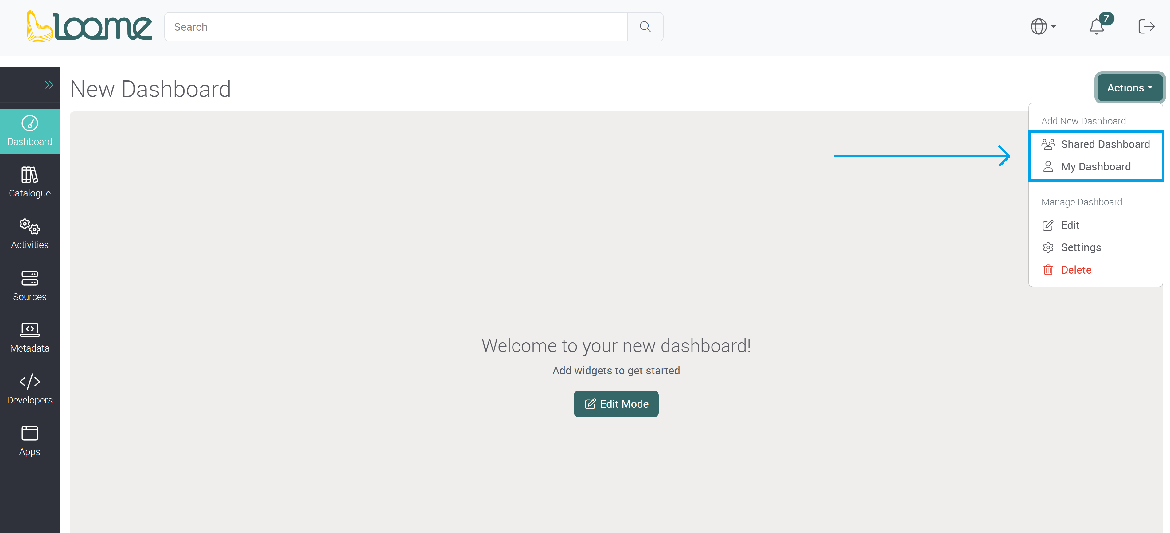
Shared Dashboard will create a dashboard that can be viewed by all users of the Portal or users that you have selected to create an audience.
My Dashboard will create a personal dashboard that can only be viewed by you.
Personal Dashboard
Choose My Dashboard.
Provide a name for the dashboard.
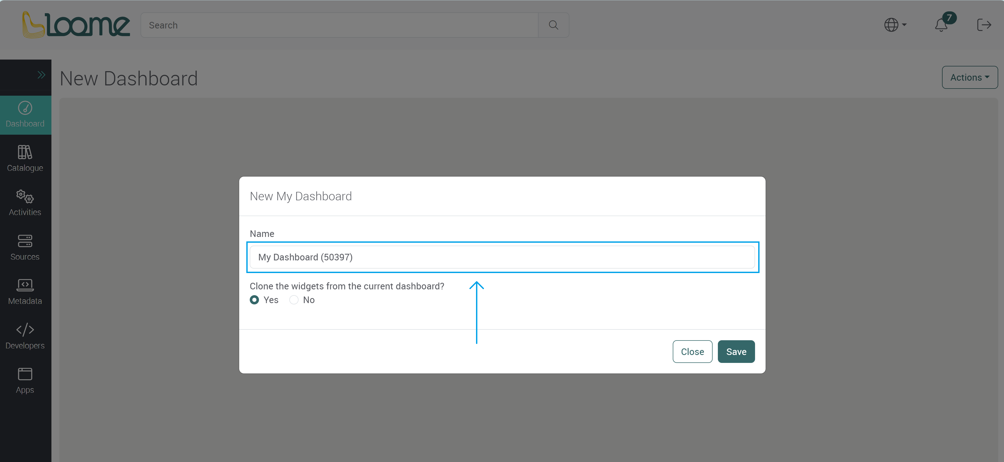
Choose to clone the existing widgets in the current dashboard. This will copy the current dashboard and you can then make changes to the cloned dashboard.
Shared Dashboard
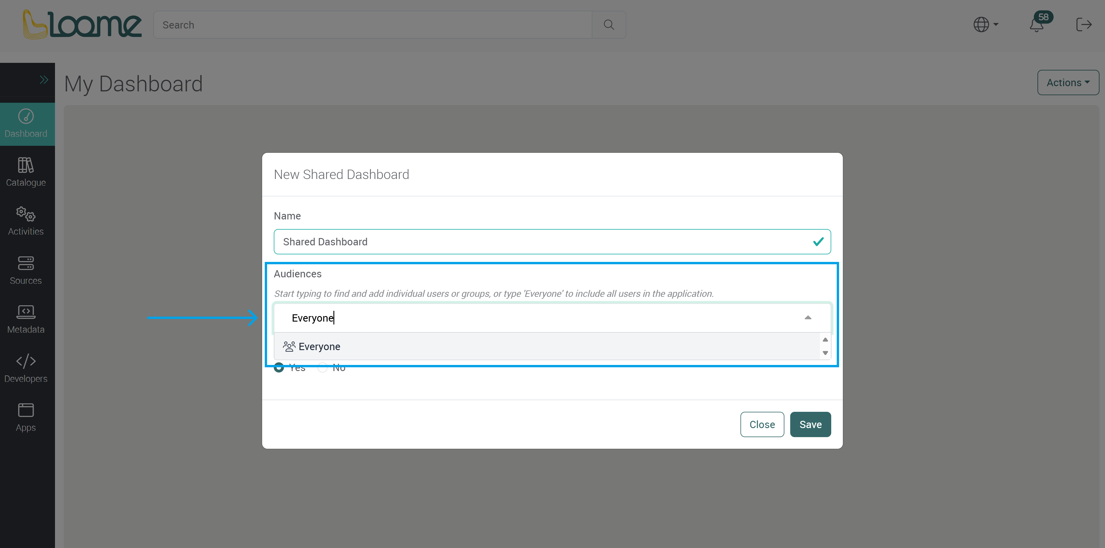
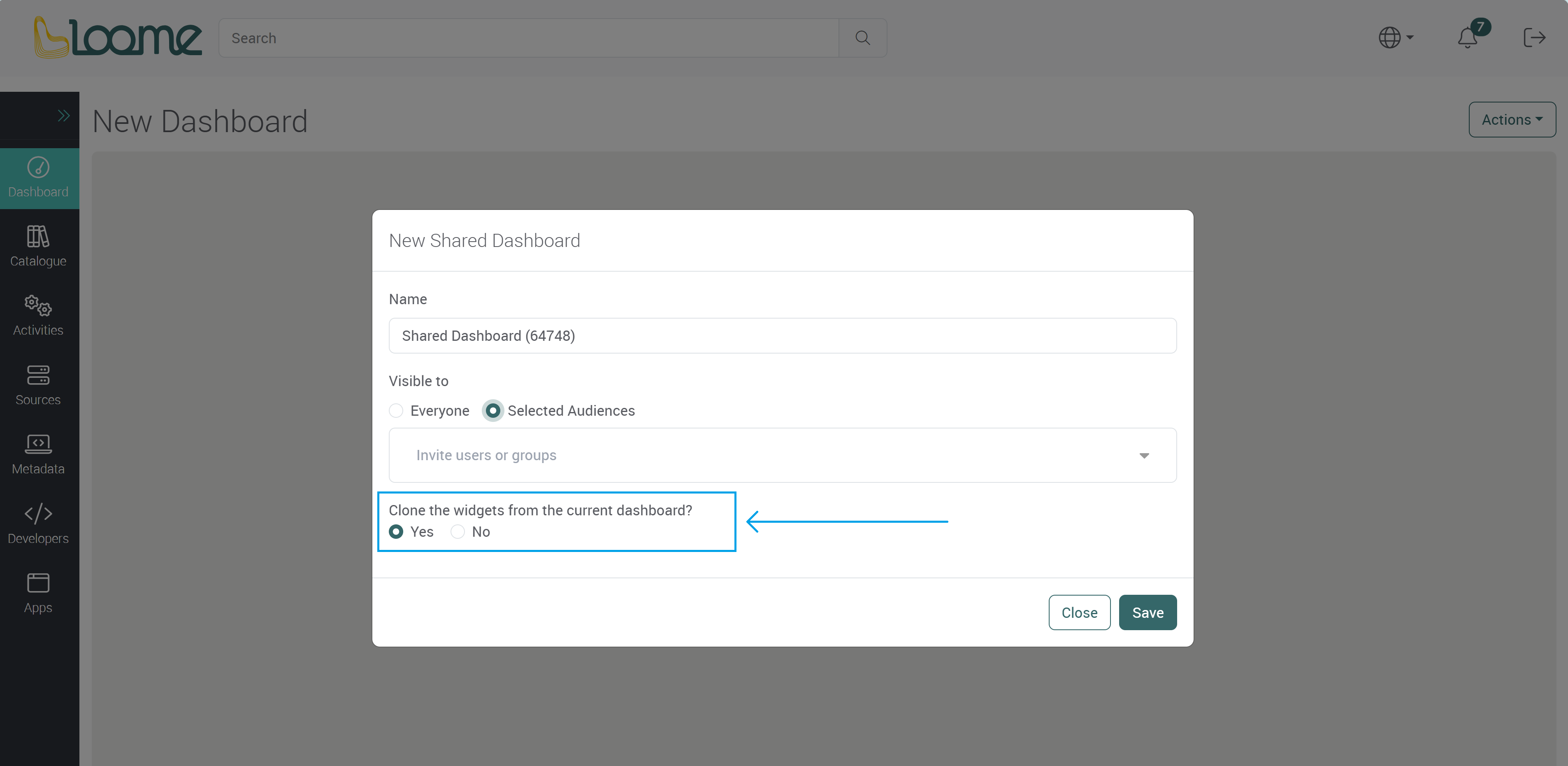
Choose Shared Dashboard.
Provide a name for the shared dashboard.

Choose who this dashboard will be visible to in Audience.
- Typing in ‘Everyone’ will display this dashboard to everyone in the Portal in the ‘Shared Dashboards’ section.
- Or you can choose an audience and the dashboard will only be visible to your selected users. Start typing to find and add individual users or groups.
To add all users in the Portal, type in ‘Everyone’ and then select it from the dropdown.
If you choose to add a specific audience, type in the email addresses of users or the name of the group that will be able to view this dashboard.
Choose the user or group from the dropdown.

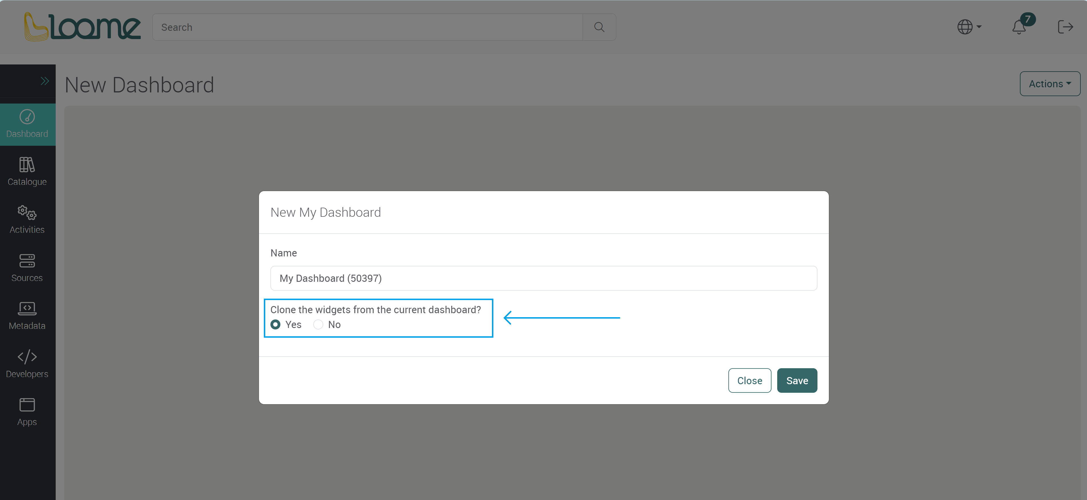
Choose whether the current widgets will be cloned into the new dashboard.
Click Save to create this dashboard.
You can now customize the dashboard and add new widgets.
Customize your Dashboard
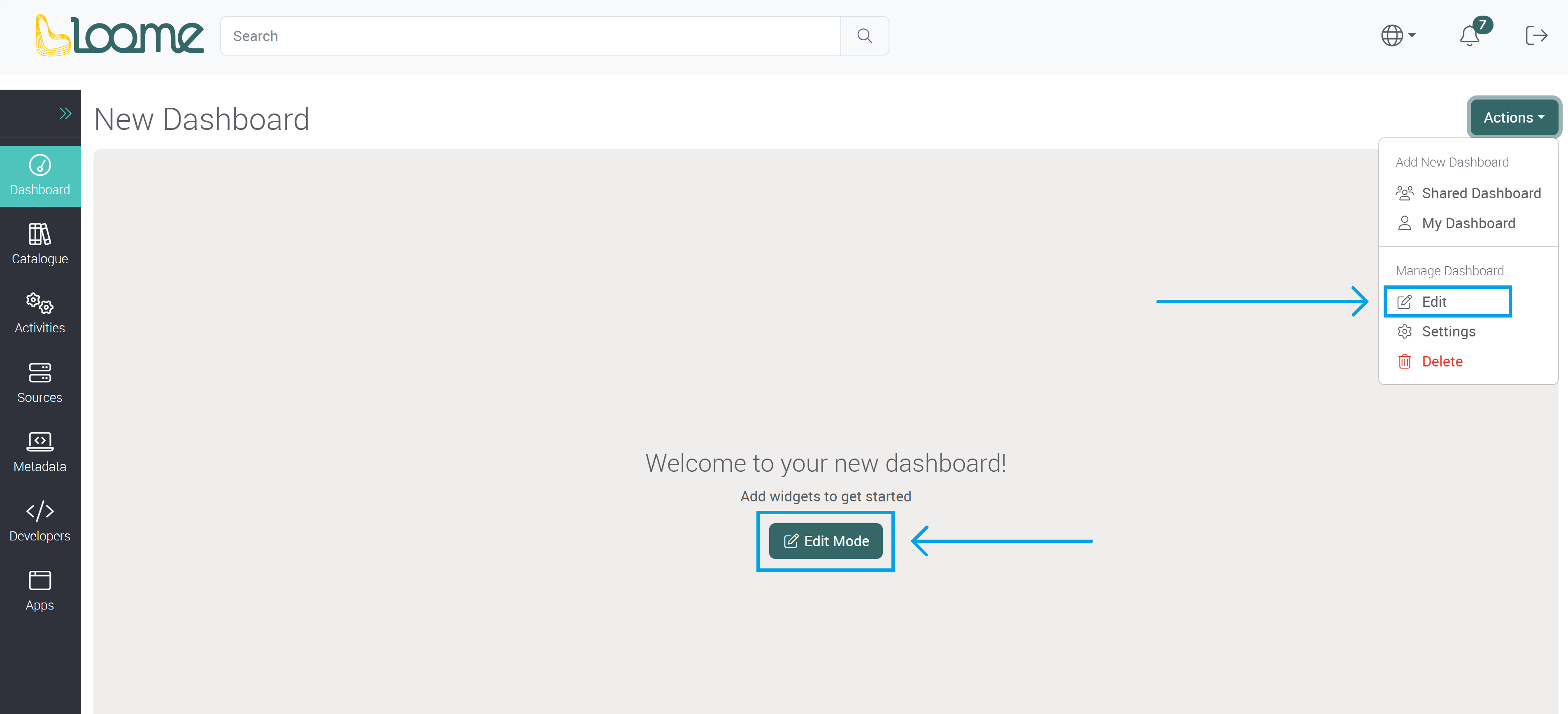
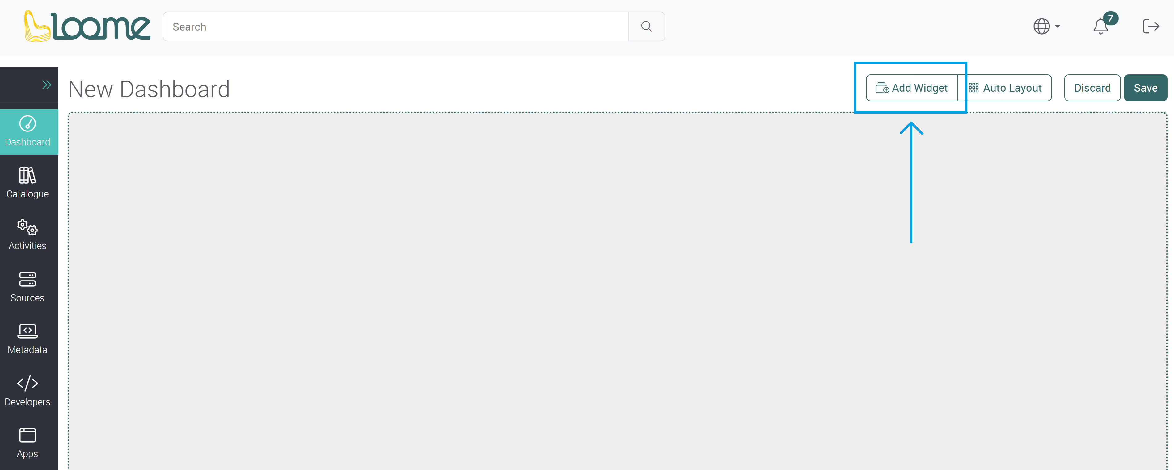
Click on Edit in the Actions dropdown, or click on Edit Mode.
Click on Add Widget.
Widget Types
Choose the type of widget you would like to add.
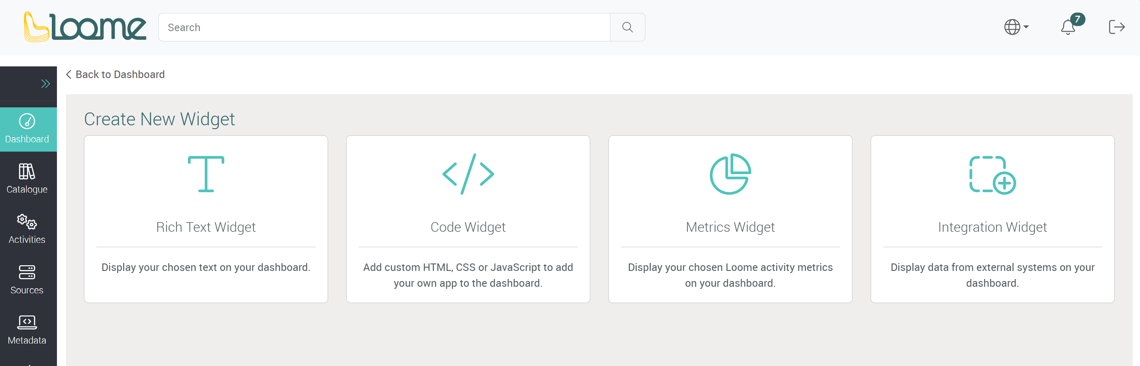
Rich Text Widget
Display your chosen text on your dashboard.
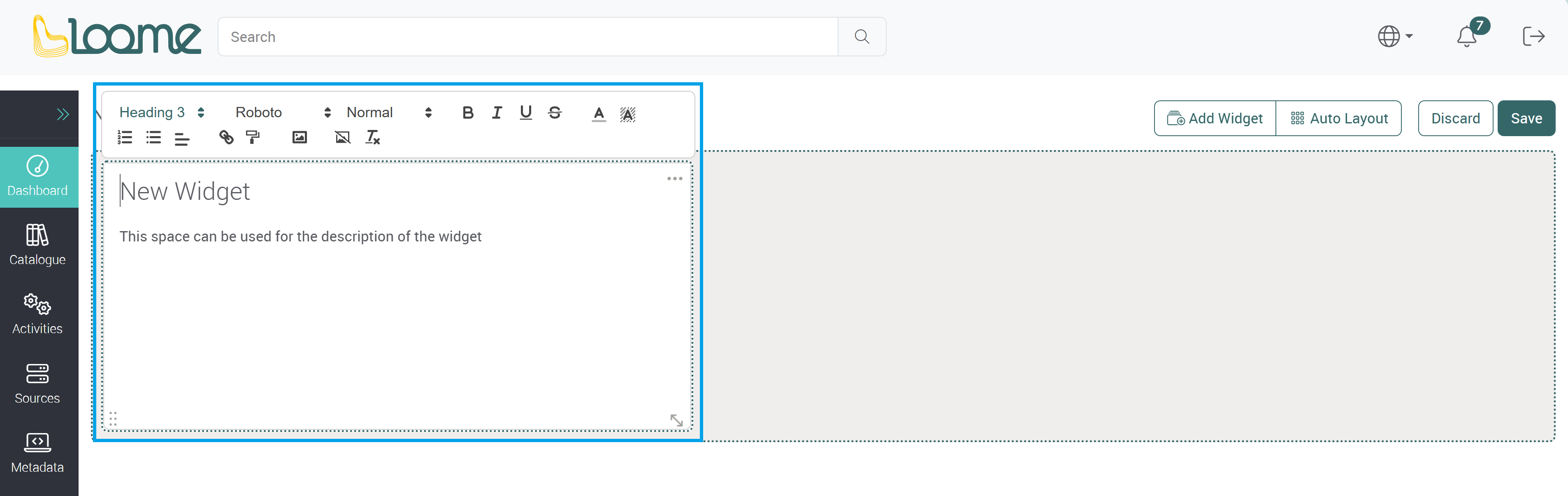
Provide a title in the top field of the text widget.
Then provide the content of the widget below.
Clicking on the widget will display the text formatter above the widget. You can apply formatting to the text using the options available.
For example, - Choose the heading format, text font and size. - Choose to make lists, change the text color and background. - Insert hyperlinks and images. - Make an image the widget background (Add an image and click on Set Background).

How to Add an Image to a Text Widget
You can add an image to a text widget by first clicking on the text widget. Click where you would like to add the image.
The text widget formatter will display above the widget.
Click on the Add image button.

Choose your image and then click on the image to add it to the widget.

Or you can also click on the + button.

You can add an image as a background image of the widget, so text will display in front of the image in the widget, by clicking on Add Background Image here on your chosen image.

You can search through the images by using the filter bar above the images.
Type in your image name in the filter to search.

You can upload images so you can then add them to a text widget by clicking on Upload. Any uploaded images will be displayed here.

You can delete an image by clicking on Delete on your chosen image.

If you have added an image to a widget and want to delete it, you can use the Backspace or Delete key on the image.
If you want to remove a background image from a widget, click on Remove Background Image in the text widget formatter.

Code Widget
Add custom HTML, CSS or JavaScript to add your own app to the dashboard. API requests can also be used in a code widget.
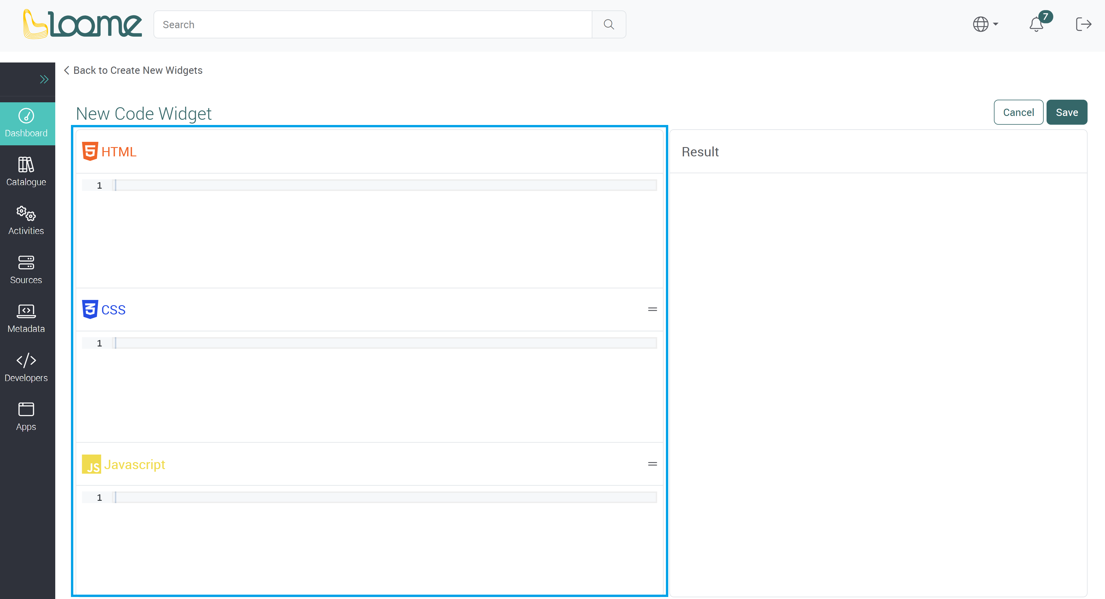
Provide your code in the section on the left.
Optionally, you can also use an API request in the code widget. When you start typing, it will display available API requests by name. Selecting or pressing on ‘Tab’ will autocomplete the API request and put down any parameters on the API request. (You can also press ‘CTRL’ and ‘SPACE’ to view a list of available API requests. It will autocomplete any parameters.)
You can view the result in the section on the right. Click on Run to view a preview.
You can click on Ok to return to the dashboard with the current state of the widget.
You can then save the dashboard at the top-right to save all widgets in the dashboard.
Integration Widget
Display data from external systems on your dashboard.
If you have already added the external system as a source system, you may be able to pin the data, such as a report, to a dashboard from the catalogue. Using this method, you can add a widget directly from an asset.
Choose from:
- Power BI Report (from Microsoft Fabric)
- Power BI Dashboard (from Microsoft Fabric)
- Power BI Dataset (from Microsoft Fabric)
- As well as any custom entity types that have an embedding library that you added to your own Loome Portal tenant.
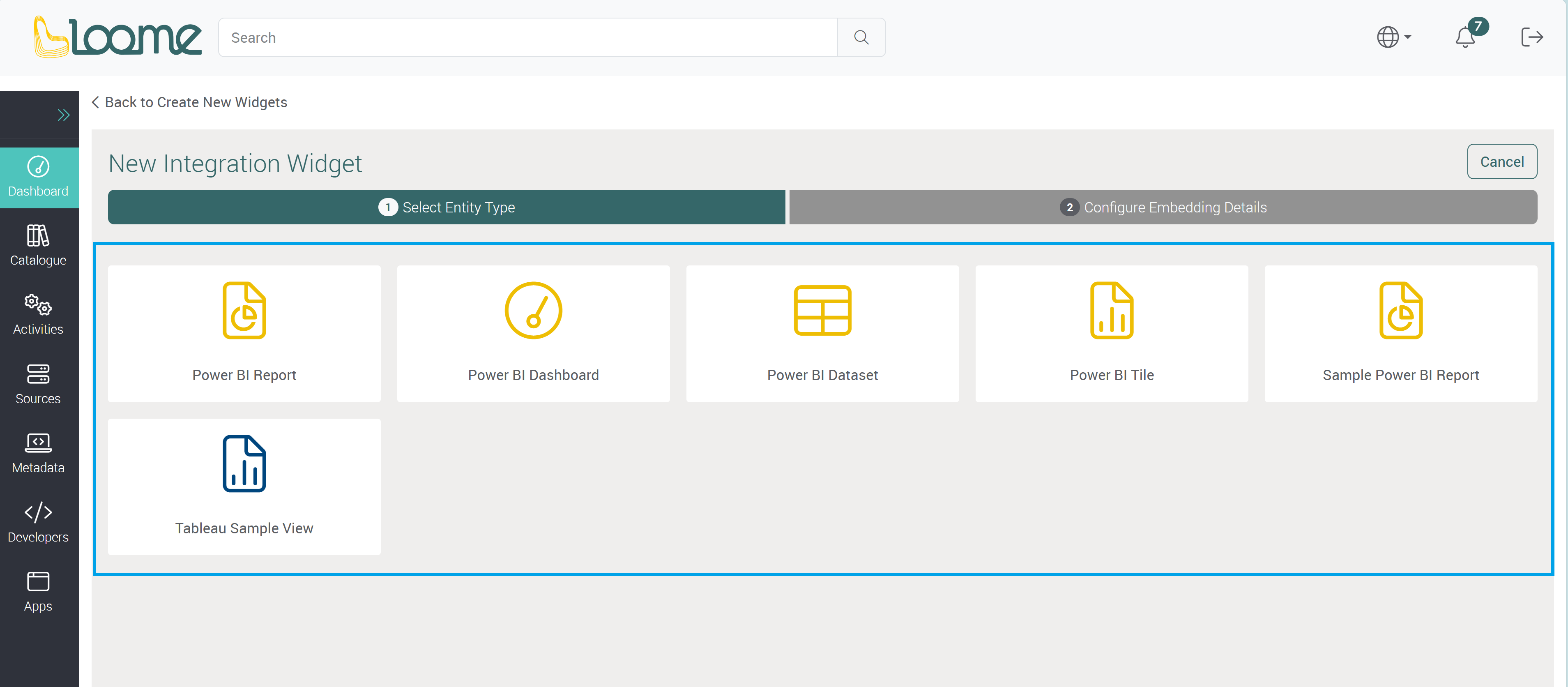
Select an Entity Type and click on Next.
The following example is for a Microsoft Fabric report.
Provide a URL to the asset you would like to embed.
In the Embed Url field, add in the Embed Url provided by Microsoft Fabric.
For example, to find the Embed Url for a Microsoft Fabric report:
- You can open the asset at the source and copy the Embed URL, from the Embed URL field in Microsoft Fabric.
- Or you can copy the ID number from the URL at the source and add it to the end of the following URL at ‘Id=…’. For example, for an app Microsoft Fabric Report:
https://app.powerbi.com/reportEmbed?reportId=ID_NUMBER_HERE&appId=APP_ID_NUMBER
Depending on whether it is an app, report or dashboard, the link and ID you copy will be different.
Other example Urls:
| Entity Type | Embed Url Example |
|---|---|
| Microsoft Fabric App Report | https://app.powerbi.com/reportEmbed?reportId=ID_NUMBER_HERE&appId=APP_ID_NUMBER |
| Microsoft Fabric Report - Non-app | https://powerbi.com/reportEmbed?reportId=ID_NUMBER_HERE |
| Microsoft Fabric App Dashboard | https://app.powerbi.com/dashboardEmbed?dashboardId=ID_NUMBER_HERE&appId=APP_ID_NUMBER |
| Microsoft Fabric Dashboard | https://powerbi.com/dashboardEmbed?dashboardId=ID_NUMBER_HERE |
| Microsoft Fabric Dataset | https://powerbi.com/qnaEmbed?datasetId=ID_NUMBER_HERE |
You can provide a URL to open if the asset is clicked in the field for the Overlay Link. It will direct the user to the URL.
Please note that any interactive functions of the asset will be unavailable when overlaying a link.
Then choose whether clicking on the widget will open the link for the URL you provided in a new tab.
Save this widget and you can view it on your dashboard.
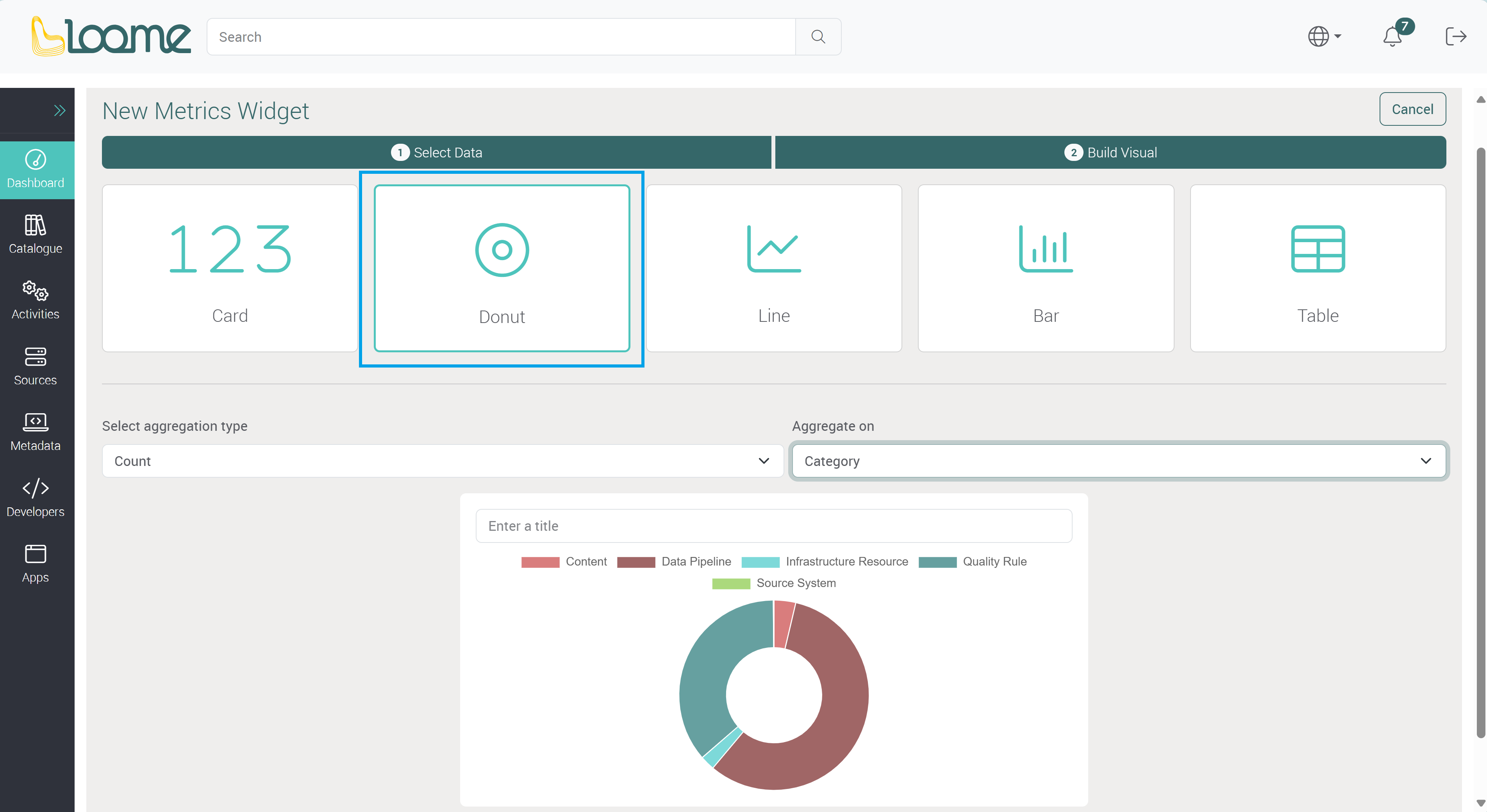
Metrics Widget
A metrics widget will display your chosen Loome activity metrics on your dashboard. You can display values from your columns in Assets, Activities, Attributes and Tags.
First, choose a data type from the dropdown:
- Assets,
- Data Pipeline Executions,
- Resource Usage,
- Quality Rule Executions,
- and System Syncs.

The table will be displayed in hierarchy view by default. If you would like to use a date or date time column, you can change it to table view to instead display more records in the metric widget. A metric widget that uses hierarchy view will use the displayed overall row, rather than each record that is shown when expanded in table view.
You can then filter the content in the table of your chosen data type or click Next to select the type of metric.
There are different types of metrics you can display on a dashboard.
Choose from a card, donut chart, line chart, column chart, and table metric.
- Card: This will display the count, sum, average, min or max number on a card.
- Choose an aggregation type of count, sum, average, min or max.
- Depending on the selected aggregation type, the following fields that may be required will differ.
- Then choose a column or attribute that contains the values for this metric.
- Choose a Format Style such as currency, unit, decimal, or percent. This depends on the type of your data values, e.g., the sum of a cost column would be ‘currency’.
- If you choose currency or unit, choose the type of unit or currency in the next dropdown field, and then the format, such as a narrow symbol or currency code. You can search for a currency in this field and choose it from the dropdown.
- Choose an aggregation type of count, sum, average, min or max.

- Donut: This will display a donut chart of your selected column values.
- Choose the aggregation type from the Aggregation Type dropdown.
- Depending on the selected aggregation type, the following fields that may be required will differ.
- Except for the ‘Count’ aggregation type, you can choose a column or attribute for Value that has the data for the donut metric.
- Then choose a Category. This will display the names of the values in a key.
- Choose the aggregation type from the Aggregation Type dropdown.
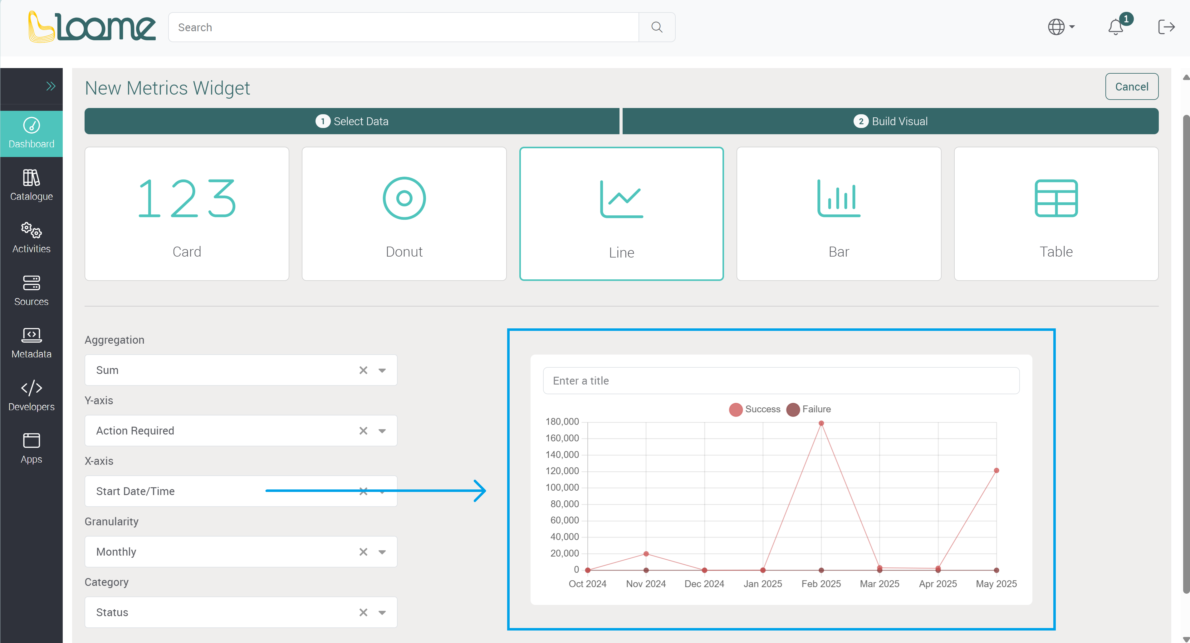
- Line: This widget will display a line chart with your column selection of values along your chosen x axis.
- Choose an Aggregation Type of count, sum, average, min or max.
- Depending on the type, the following fields will differ. For example, you may require an X-axis but not a Y-axis.
- Choose a column or attribute for the Y-axis.
- Choose a unit for the Y-axis column. This will be dependent on the type of column. For example, a datetime column will have the granularity field but not a unit field.
- The unit will display next to the field name beside the axis, e.g., ‘Average (%)’.
- Choose a unit for the Y-axis column. This will be dependent on the type of column. For example, a datetime column will have the granularity field but not a unit field.
- Choose an X-axis column. For example, this may be a date column that will set date markers across the line chart. Depending on the column type, you may then choose a granularity or unit.
- Choose the Granularity of hourly, daily, monthly, and yearly. This will change the markers accordingly on the X-axis, for example daily will have the day values across the axis, and monthly will have each month across the axis.
- Choose a unit for the X-axis column. This will be dependent on the type of column. For example, a datetime column will have the granularity field but not a unit field.
- The unit will display next to the field name beside the X-axis, e.g., ‘Spend (AUD)’.
- If you also choose a Category column, instead of the one line in the chart, there will be a line for each value in your selected column.
- For example, the ‘Asset Type’ column will display a line chart for each asset type in your chosen data, so if I chose ‘Status’ as the category it will display a line chart each for the statuses ‘Success’ and ‘Failure’ in the one widget.
- Choose an Aggregation Type of count, sum, average, min or max.

- Column: This will display a column chart with values from your selected column.
- Choose an Aggregation Type of count, sum, average, min or max.
- Depending on the selected aggregation type, the following fields that may be required will differ. For example, you may need to provide an X-axis but not a Y-axis.
- Then choose a column or attribute for the Y-axis. The aggregation type will apply to this column.
- Choose a unit for the Y-axis column. This will be dependent on the column type. For example, a datetime column will use the granularity field instead of a unit field.
- The unit will display next to the field name beside the axis, e.g., ‘Average (%)’.
- Choose a unit for the Y-axis column. This will be dependent on the column type. For example, a datetime column will use the granularity field instead of a unit field.
- Choose the X-axis column. This will set the values and names across the column chart.
- Choose a unit for the X-axis column. This will be dependent on the column type, a datetime column will use granularity.
- The unit will display next to the field name beside the X-axis, e.g., ‘Spend (AUD)’.
- Choose a unit for the X-axis column. This will be dependent on the column type, a datetime column will use granularity.
- If you choose a Category, it will add additional columns for the category column values in the one widget.
- If you have chosen a datetime column for any field above, you will also then choose a Granularity type of hourly, daily, monthly, and yearly.
- Choose an Aggregation Type of count, sum, average, min or max.

If you choose a datetime column for any type of metric widget, you will be also required to choose a granularity column. A granularity column will display your chosen date/time markers on the axis, for example, a monthly granularity in a line chart metric will show your selected values per month.
- Table: This will display the data you selected in the previous step and display it as a table. Provide a title for the table widget and then click on Save at the bottom-right.

Choose your Metrics Data
After you have selected a metric type, you can choose the data for each field on the left to customize your widget.

A preview of the widget will be displayed on the right of the column selection. As well as the field to provide a name for the widget.
Provide a name for the widget above the preview.
Save this widget and you can view it on your dashboard.
Manage a Dashboard
You can view all available dashboards in the left-hand secondary menu. Shared dashboards will be displayed first and following will be any personal dashboards under the title ‘My Dashboards’.
The first dashboard in the shared dashboards list will be displayed on first load of the Loome Portal or when the browser is refreshed. While browsing the Portal, if you have not refreshed the page, the last selected dashboard will be loaded again when you return to the ‘Dashboards’ page.
Edit a Dashboard
Click on Edit to edit an existing dashboard and add or modify widgets.
View Dashboard Details
You can view the details of a dashboard by clicking on Settings in the Actions dropdown.

You can edit the name of an existing dashboard here.

Delete a Dashboard
You can delete a dashboard while viewing a dashboard by clicking on Delete in the Actions dropdown.

Manage Dashboard Widgets
Refresh a Widget
You can refresh a widget while viewing a dashboard by clicking on the ellipsis button at the top-right of a widget.
Click on Refresh in the dropdown.

Edit a Widget
When editing a dashboard, you can edit an existing widget by clicking on Edit in the top-right dropdown of a widget. This will direct you to the wizard where you can customize the selected widget.

Clone a Widget
While editing a dashboard, you can clone an existing widget.
Click on the ellipsis button at the top-right of a widget and then click on Clone.
It will clone the widget to the same dashboard.

Delete a Widget
When editing a dashboard, click on the top-right dropdown of the widget you want to delete.
Then click on Delete.

Move a Widget
You can move a widget by clicking on the drag button at the bottom-left of a widget.

Resize a Widget
You can resize a widget by dragging the arrow button at the bottom-right of a widget.

Auto Layout
If you want to automatically move all widgets to fill available space, you can click on Auto Layout.
This will move all widgets up and if they are a matching size, it will move widgets into a space it fits into above.

Save your Dashboard
You can save the changes to your widgets and dashboard by clicking on Save at the top-right of the dashboard.

Discard Changes to your Dashboard
You can discard the changes made to your widgets and dashboard by clicking on Discard at the top-right of the dashboard.

Change the Order of Dashboards in the Menu
You can change the order of dashboards in your menu.
Hover over the dashboard you want to move and the drag icon on the right will appear.
Click and hold on the dashboard and you can then move it to another position in the menu.
